You've inspired
this into existence
Together with our supporters, dedicated volunteers, researchers and NHS staff, we embarked on a journey to frame the charity's identity.
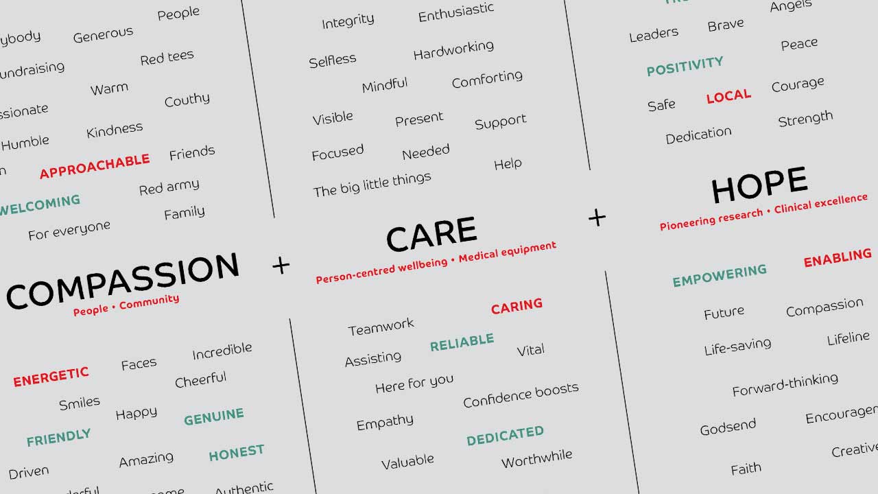
Led by FortyTwo Studio, our community and the general public were asked a series of questions to understand what Friends of ANCHOR meant to them. From there a new mission, vision and set of values were penned that wholeheartedly reflect the charity’s dedication to bringing "compassion, care, and hope" to those affected by a cancer diagnosis or blood disorder here in the North-east.
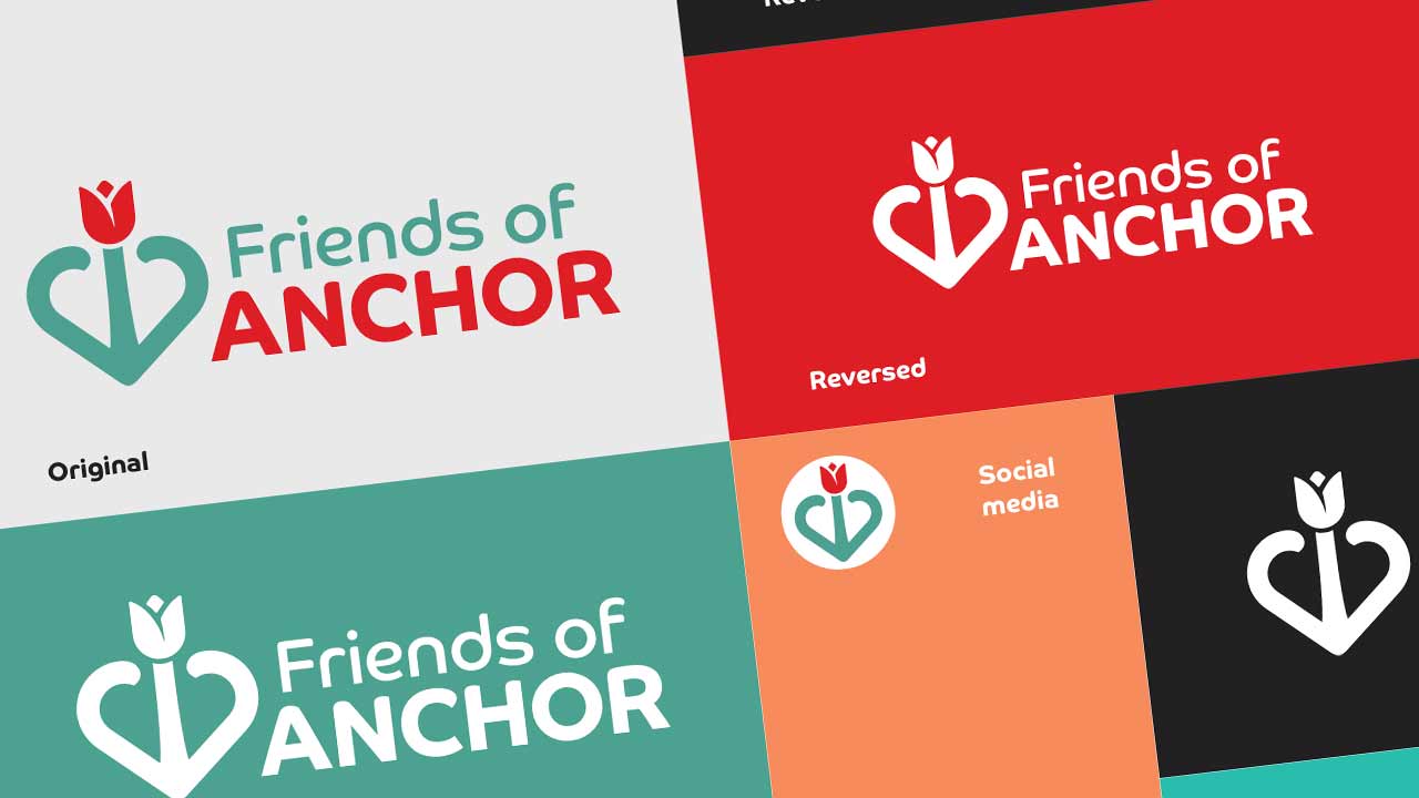
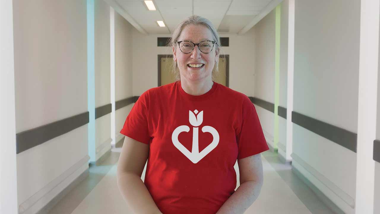
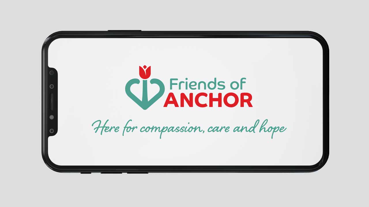
During the discovery with FortyTwo, Balmoral Group’s in-house design team masterfully crafted the new logo which holds a special symbolism.
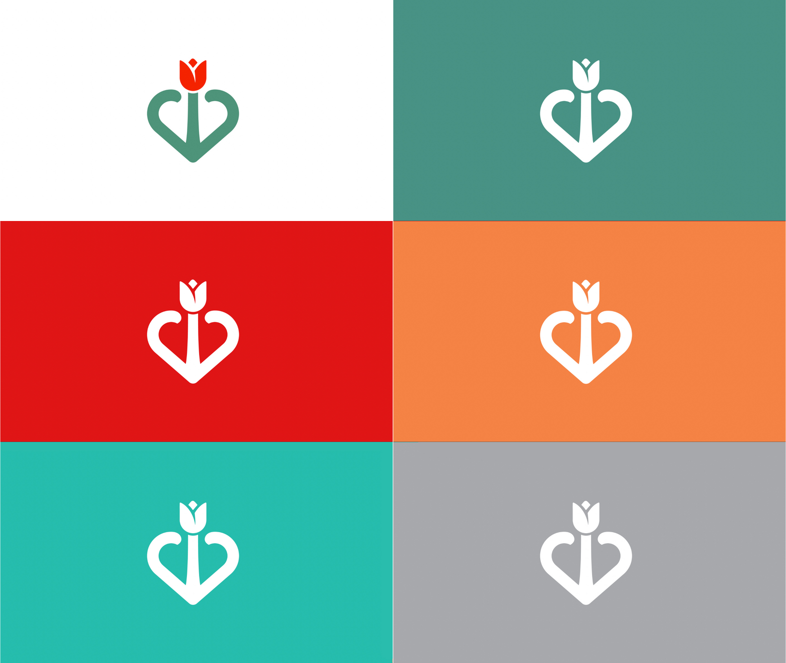
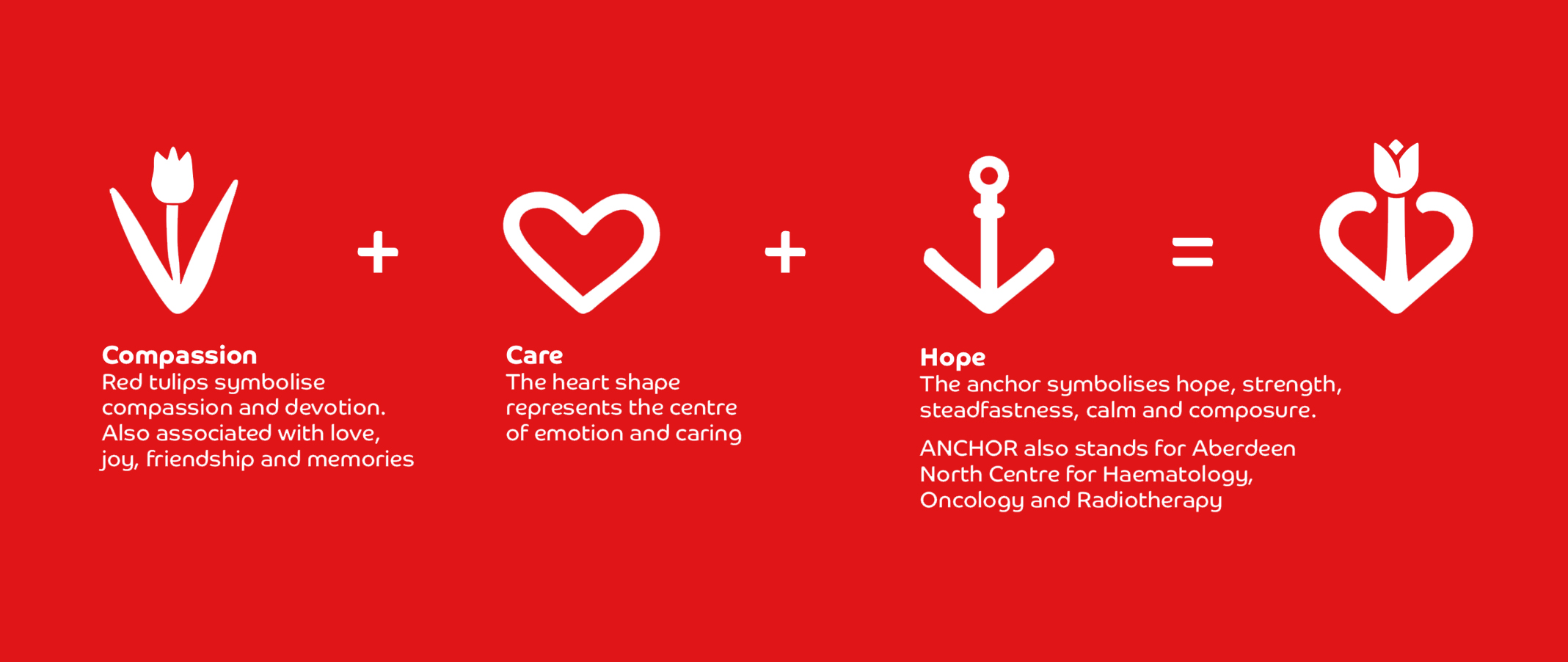
A symbolism that represents our new tagline ‘Here for compassion, care and hope’. Our very own AnchorHeart.
Inside the organisation, those three words are purpose at the centre of everything we do - the guiding light that’ll steer the future for the charity.
Externally, they combine beautifully in our iconic symbol.
Intricately at play alongside our new look and tagline is our vision, mission and values. These too shape how we operate and continue to positively impact the lives of those affected by a diagnosis.
If you took part in one of the focus groups or completed the survey, a big, heartfelt thank you from all of us at Friends of ANCHOR for the precious time and input you gave to the discovery process.
You inspired and informed what you see on this page – you're ultimately the authors of our new branding.

